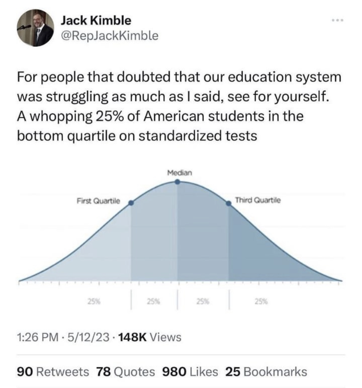
No, this is how a graph showing quartiles will always look because quartiles, by definition, always include a fixed percentage of the studied population under them.
In this case the lower quartile will always have 25% of the population under it, 50% under the second quartile, and 75% under the third quartile.
Quartiles break a population into 4 equal portions.
I know what this graph is, I was talking about a graph that actually showed something useful. If you’ve got a couple of hours to learn something useful then you could do worse than to look at this video: https://www.youtube.com/watch?v=UBc7qBS1Ujo
Spendrill is not misunderstanding the OP. He’s just saying that if intelligence could be measured by a better metric, then distribution of that metric among the population would not look as smooth as the one in the OP.
Not if you’re breaking the data into quartiles. Holy shit, do you really think the curve will be any different? Really? All that will happen is that some people will move around in the distribution. And the smoothing does not at all relate to how intelligence is measured but rather how it’s reported - in this graph.


No, this is how a graph showing quartiles will always look because quartiles, by definition, always include a fixed percentage of the studied population under them.
In this case the lower quartile will always have 25% of the population under it, 50% under the second quartile, and 75% under the third quartile.
Quartiles break a population into 4 equal portions.
While that’s true, the actual empirical curve does not have to be smooth. Or gaussian.
I know what this graph is, I was talking about a graph that actually showed something useful. If you’ve got a couple of hours to learn something useful then you could do worse than to look at this video: https://www.youtube.com/watch?v=UBc7qBS1Ujo
Spendrill is not misunderstanding the OP. He’s just saying that if intelligence could be measured by a better metric, then distribution of that metric among the population would not look as smooth as the one in the OP.
Not if you’re breaking the data into quartiles. Holy shit, do you really think the curve will be any different? Really? All that will happen is that some people will move around in the distribution. And the smoothing does not at all relate to how intelligence is measured but rather how it’s reported - in this graph.
I think you’re talking past each other — you’re talking about the box plot and they’re talking about the histogram