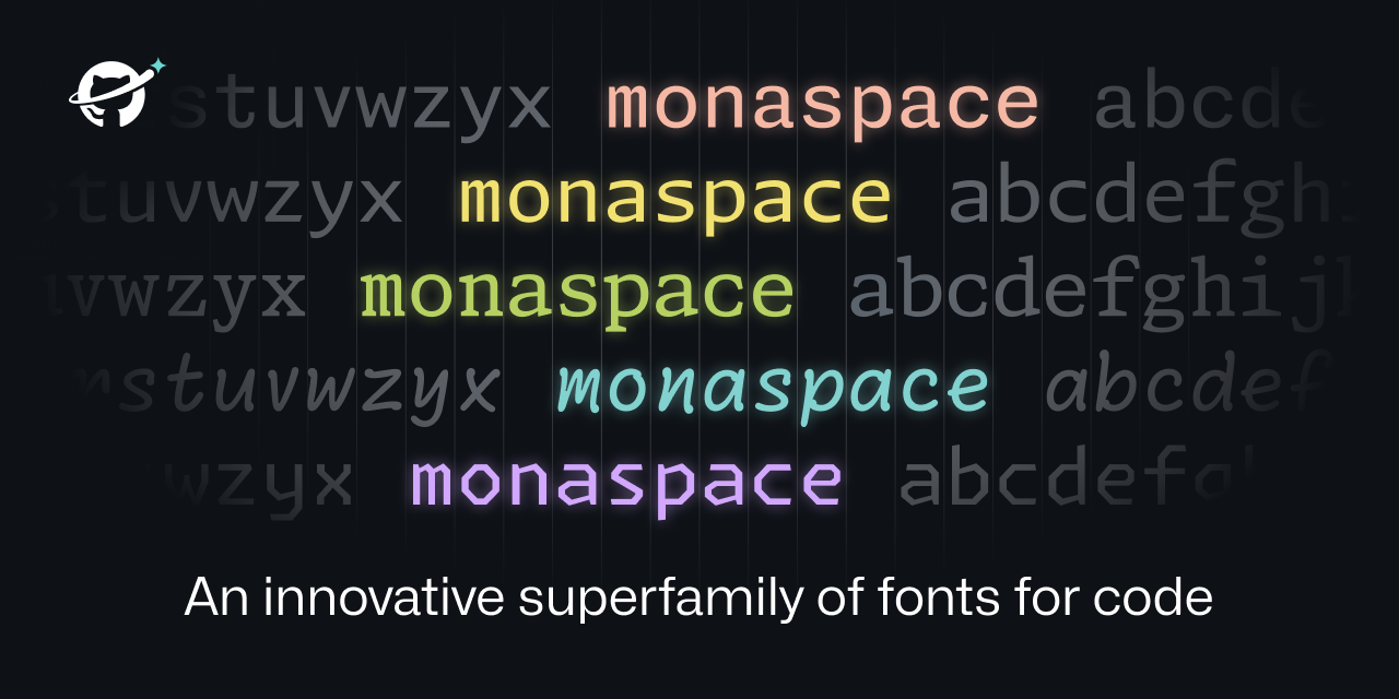
@simple@lemm.ee to Programming@programming.devEnglish • 2 years agoMonaspace - Microsoft presents a new font family for codemonaspace.githubnext.comexternal-linkmessage-square78arrow-up1289 cross-posted to: technology@lemmy.mlhackernews@derp.foo
arrow-up1289external-linkMonaspace - Microsoft presents a new font family for codemonaspace.githubnext.com@simple@lemm.ee to Programming@programming.devEnglish • 2 years agomessage-square78 cross-posted to: technology@lemmy.mlhackernews@derp.foo
minus-square@murtaza64@programming.devlinkfedilink6•2 years agoIt looks like it’s not an actual height difference, but the smaller width makes the second i look significantly smaller than the first, also implying a lower height.
minus-square@OmnipotentEntity@beehaw.orglinkfedilink4•edit-22 years agoTrue, they are the exact same height. Holy optical illusion, Batman! I suppose this is part of what makes font design so difficult.
minus-square@jeffhykin@lemm.eecakelinkfedilink2•2 years agoWelp, another reason I will absolutely not be using glyph-streching or whatever Microsoft called it.


It looks like it’s not an actual height difference, but the smaller width makes the second i look significantly smaller than the first, also implying a lower height.
True, they are the exact same height. Holy optical illusion, Batman!
I suppose this is part of what makes font design so difficult.
Welp, another reason I will absolutely not be using glyph-streching or whatever Microsoft called it.