@silence7@slrpnk.netM to Climate - truthful information about climate, related activism and politics.@slrpnk.netEnglish • 2 years agoIt’s Not Your Imagination. Summers Are Getting Hotter.www.nytimes.comexternal-linkmessage-square24arrow-up1233
arrow-up1233external-linkIt’s Not Your Imagination. Summers Are Getting Hotter.www.nytimes.com@silence7@slrpnk.netM to Climate - truthful information about climate, related activism and politics.@slrpnk.netEnglish • 2 years agomessage-square24
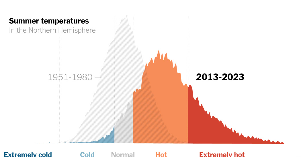
minus-squarecallyrallinkfedilink7•2 years agowhat’s up with that graph? like just have temperature on the Y axis and time on the X axis it’s not that hard
minus-square@silence7@slrpnk.netOPMlinkfedilink10•2 years agoThey’re trying to show a change in probability distribution, not just a temperature change over time. I agree that scale and such would be helpful.

what’s up with that graph? like just have temperature on the Y axis and time on the X axis it’s not that hard
They’re trying to show a change in probability distribution, not just a temperature change over time. I agree that scale and such would be helpful.